
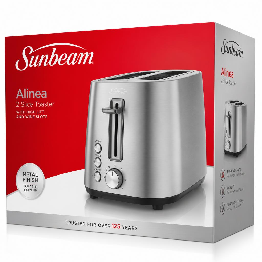
Sunbeam - The Red & Silver Brand Refresh (Still in Market Today)
“Led the ground-up redesign of Sunbeam's global small-appliance packaging system - retiring the beige, cluttered late-80s look and introducing the bold red-and-silver architecture that still defines Sunbeam packaging on shelves today.”
Sunbeam had heritage and household trust, but its packaging language hadn't kept up. Beige boxes, dated typography, callout-heavy fronts and inconsistent per-category treatments were losing the shelf fight against newer, cleaner CPG competitors. The refresh had to modernize the brand without breaking recognition, cover dozens of SKUs across toasters, mixers, kettles, blenders, irons and personal care, and hold together across Walmart, Costco, Home Depot and Canadian Tire planograms in multiple markets and languages.
- 01Set the strategic brief with Product Management, Marketing and Sales - reposition Sunbeam as confidently modern while protecting the equity of the wordmark
- 02Designed a red-and-silver colour system that reads across categories and holds shelf presence at a glance
- 03Built a scalable packaging architecture: hero product photography, disciplined type hierarchy, silver metallic accents, and a callout system that stopped fighting the product
- 04Directed hero product photography, food styling and compositing that could be re-cropped and re-purposed across SKUs, markets and retailer-specific pack formats
- 05Ran the CPG product-management side alongside creative - briefs, artwork approvals, translations, regulatory copy, retailer requirements, manufacturing partners in China, and multi-market rollout schedules
- 06Established templates, master files and standards so the system could survive the volume and cadence of a global small-appliance portfolio without drifting
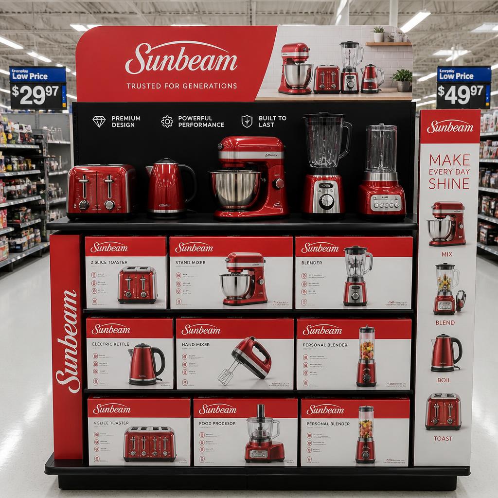
- A red-and-silver Sunbeam packaging system that has outlasted the launch by well over a decade - the framework is still being extended and used on Sunbeam packaging today
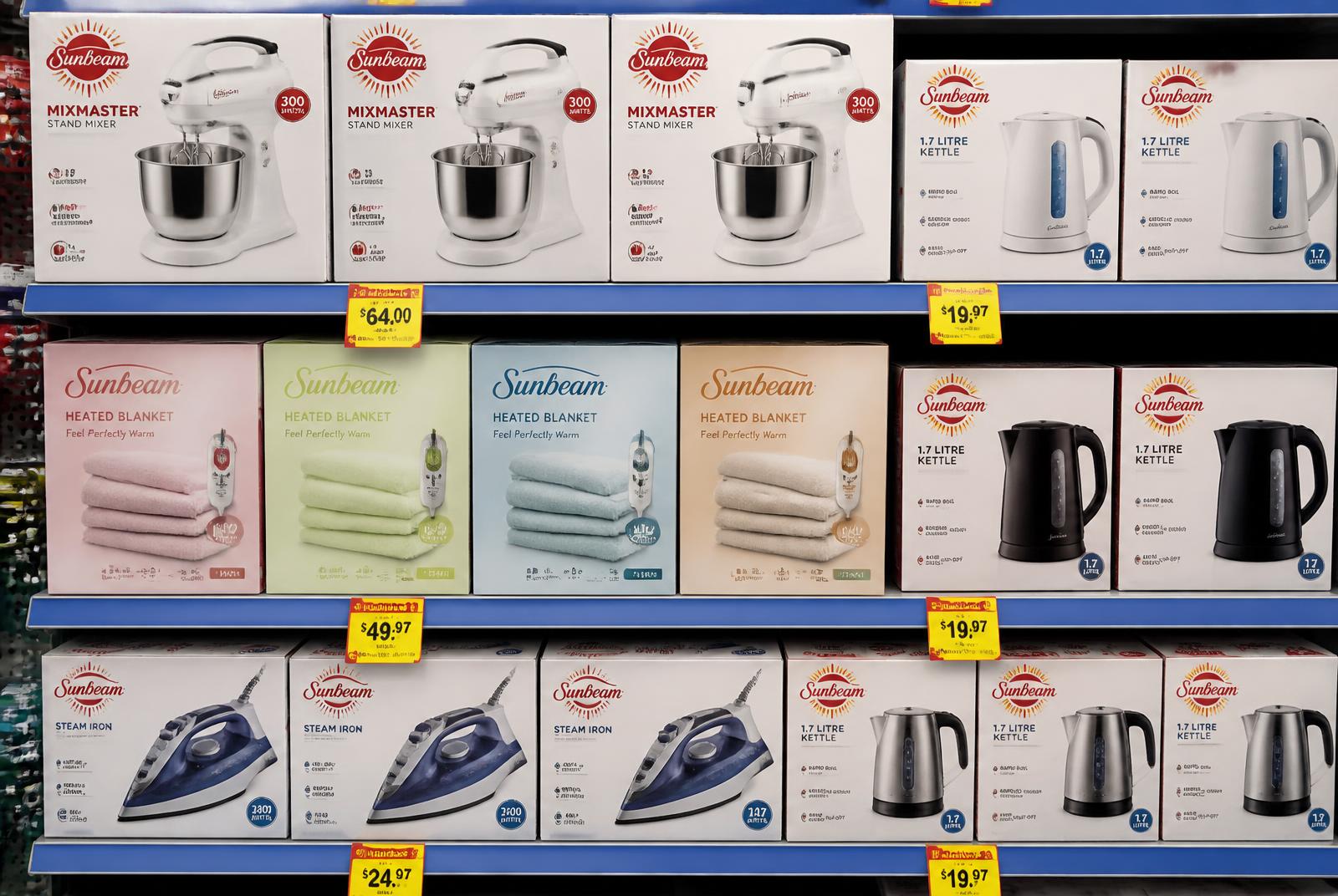
- Sharper, more confident shelf presence at Walmart, Costco, Home Depot and Canadian Tire
- Predictable, scalable production across dozens of SKUs, markets and languages - one design language, many products
- A brand-refresh + product-management playbook I've reused for every large-portfolio CPG program since
Selected imagery
Click to enlarge · 5 pieces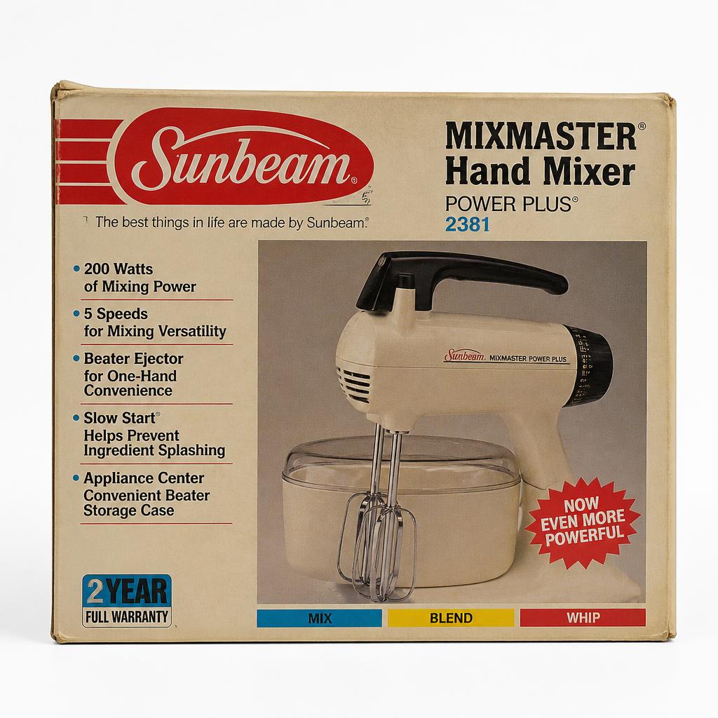
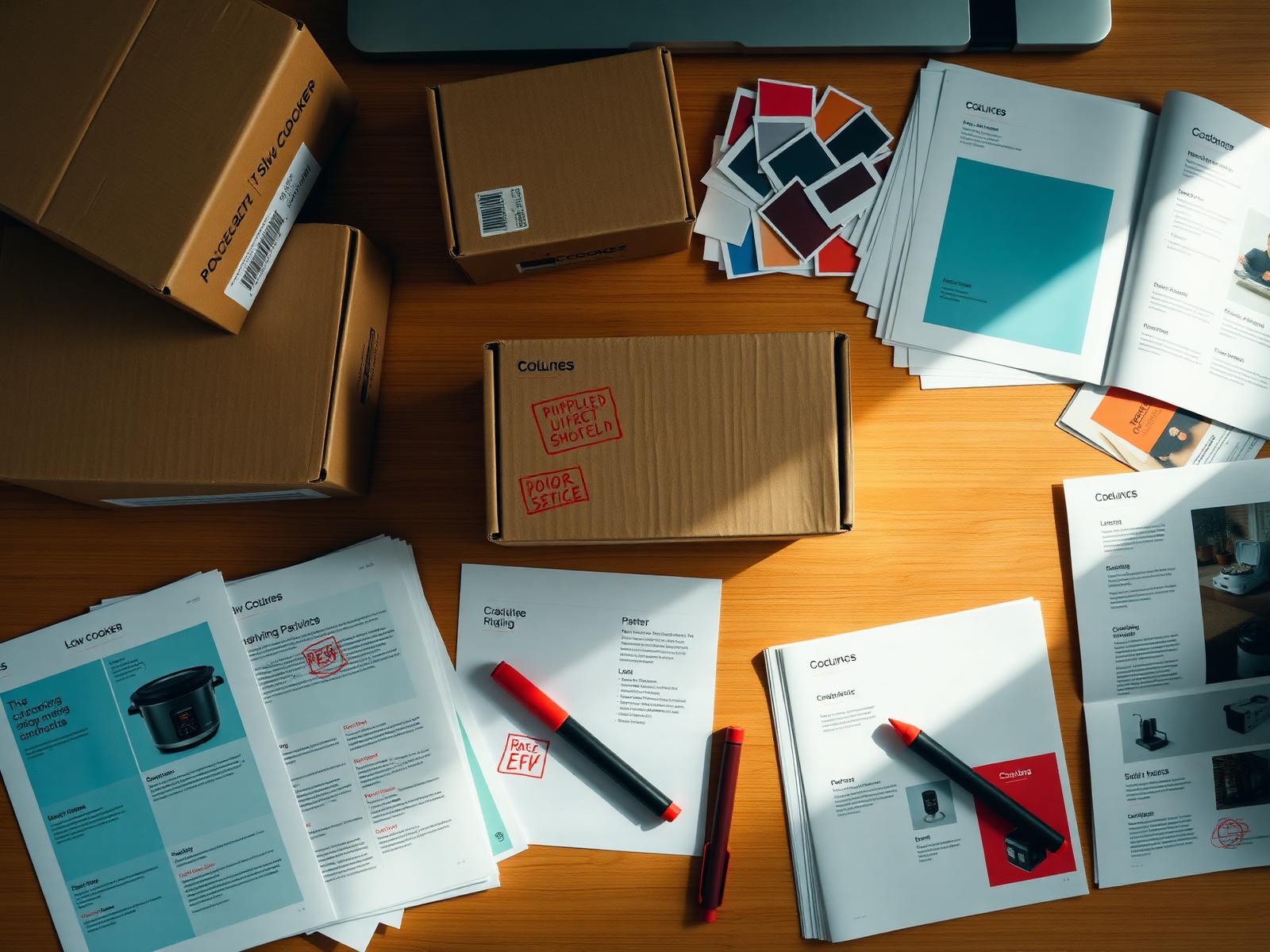
Concept, art direction & execution - Shawn Van Daele for Sunbeam / Jarden Consumer Solutions, 2005 - 2009.